APPLE: ITUNES


Apple Media Product
Apple gathers an immense amount of data from the App Store and iTunes and for years it had sat dormant. They are now creating their own internal business intelligence measuring tools.
My team was tasked to oversee a total of 10 applications (3 Platform examples are in display below)
#1 iTunes Music Graph
“I’m really pleased with how this functions and looks, much more user friendly, readable and classy. Thanks Gerard for leading the design.”
The iTunes Analytics and Editorial team needed to track how songs and artists are related to one another, with this secured experience, Music Graph was born.
Business Challenge
Currently there is no way to dictate and make business decisions based on artists and their music relationship with other artists. Apple has so much data that it was a given that this was needed to be created.
How I helped
As the Solution Experience Design Leader, I led 3 Individual Contributing Slalom Experience Designers with Apple’s team of software engineers, data scientists, business and analysts to create an interactive Sankey Data Visualization tool. The solution was extremely well received and is used by 200 global users daily.

As part of the primary research we collaborated with the business unit on how the data is going to be displayed, what type of data will feed into it and its chart interaction. The Sankey Graph became apparent as the chosen data visualization with the guidance of Data Visualization Analysts because it shows connections with each data type.

Browser Experience


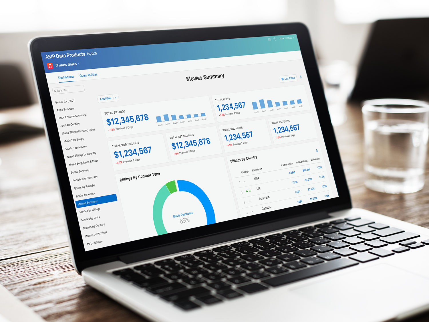
#2 Apple Media Product - Hydra
Hydra is the most powerful and largest initiative Apple has ever made internally — used by 2,000 internal users that spans to 23 countries. It is an internal business intelligence tool that visualizes all of the data from the App Store and Apple Music. Imagine all of the activities that goes on in a global scale — they are in the millions every second.
Fall 2017 Apple pushed an entirely new re-design of the App Store with new look and feel, and including editorial into the mix. With the new change, it has made data much more complex to track. With the help of Hydra's internal business analysts they will be able to build reports for Apple’s executive leadership team to make more accurate decisions on how to proceed with each organization. This tool is also open to any Apple Employee given access to get deeper dive into the metrics.

Stakeholders and Goals
Stakeholder interviews to have a holistic understanding of the current state of the team, technology stack, problems, and goals.


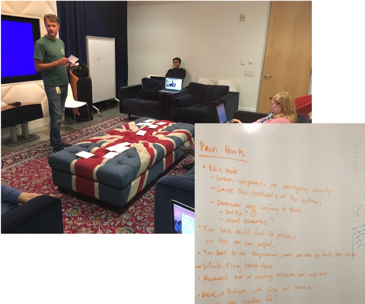


Artifact gathering and research to understand the current way of getting user’s job done. Usual tools they use to work.

Card sorting exercise to prioritize work to be infused into the development’s backlog

Process diagram to visualize how we all worked together and how the information is presented to the users themselves
Moodboard to establish the foundation of the design we need to follow for Hydra.

Hydra Design Wall
Just a few key screens from the Hydra suite of designs. From email templates, to marketing website to the actual Hydra platform. You can see and feel how much data is pouring into the pages.
I initiated pinning the design mock ups against the wall for reasons of exposure for my team, for team Hydra and to tease the passerby on the future change that's going to occur. It also stirs up conversations and get people thinking about new and old features for the platform.
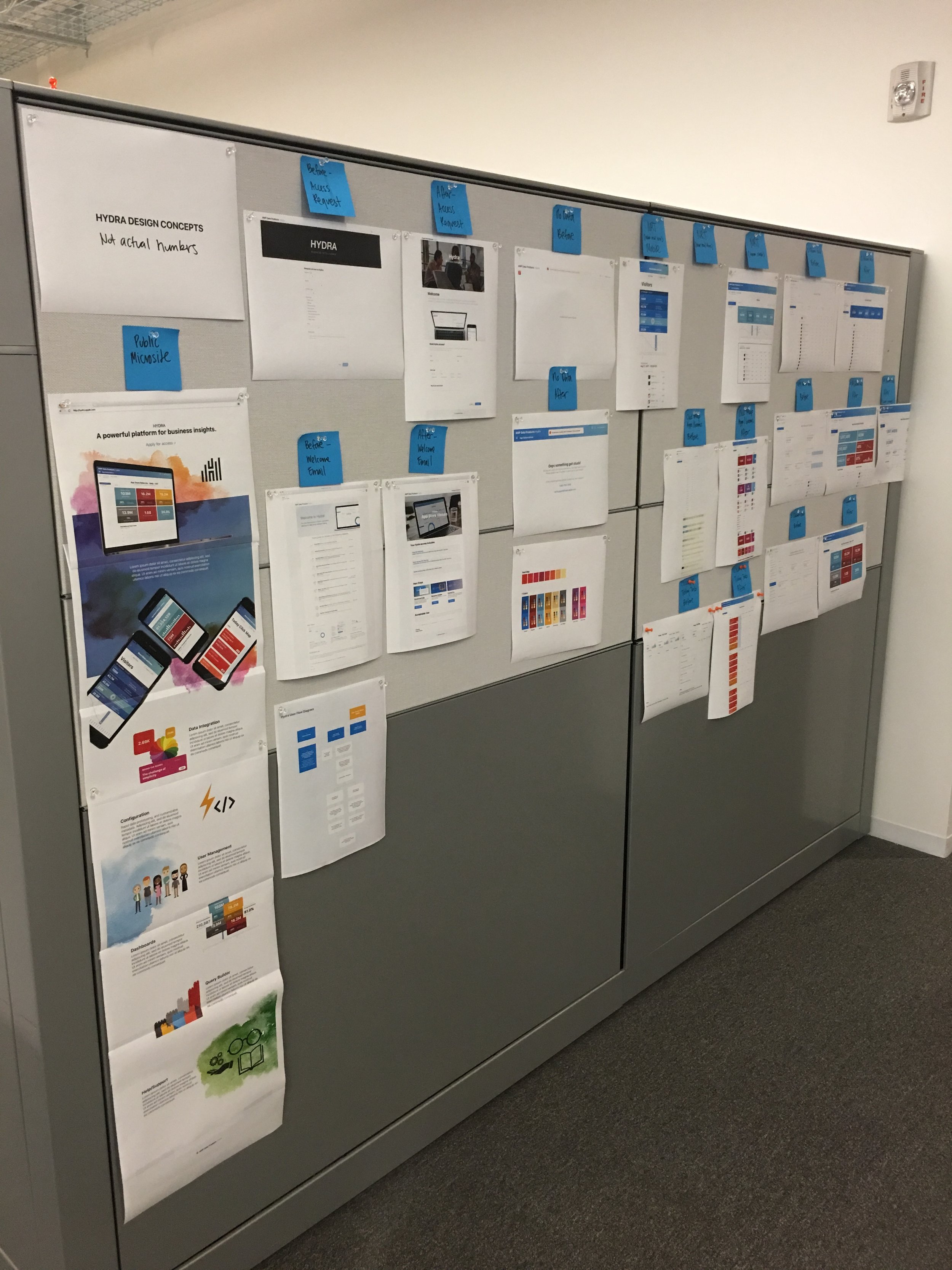

Logo and Icon designs


Hydra Browser experience


“I saw the mocks today and I’m super excited to see what the team is able to deliver!”


Hydra Mobile experience


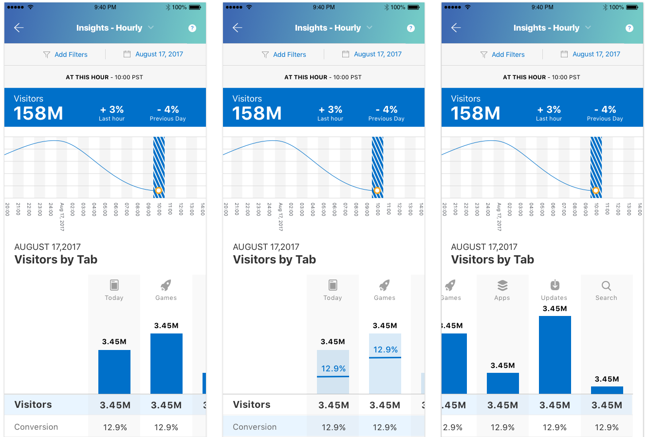
Apple Media Product - Helix Design Wall
Helix Design Wall
As a separate working tool, iTunes had a reporting tool called Helix. It takes reports from the data base with the guidance of Data Scientists to allow Analysts to search and build additional queries to get even more specific and focused reports. I led the re-acrhitecting of the tool as well as re-designing it entirely to adhere to the new Hydra and App Store.

